The Brand Identity, Imagined Rationally.
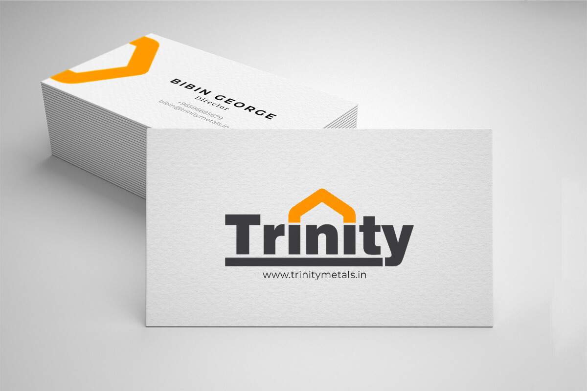
The name “Trinity” evokes the concepts of ‘three’ and ‘unity.’ In the context of home supplies, hardware, and metals, it takes on even deeper significance. The logo is thoughtfully designed to seamlessly integrate with the company’s name, eliminating the need for an additional logo and making it easier for customers to remember the brand. The logo features bold lines, enhancing visibility from a distance and allowing for effective use of lighting in front of shops and warehouses.
The repeated letter “i” in the name represents the pillars of the business empire, while the three-pointed roof connecting these pillars symbolizes the trio of individuals behind the business. The letter “n” is employed to signify infinity, reflecting the extensive range of products the company offers. By placing the ‘n’ beneath the roof, the logo conveys the brand’s commitment to offering a limitless array of products. The ‘n’ also doubles as a door, forming the shape of a house using the letter ‘i’ and adding a creative design element.
Theme
All the Logos are designed in such a way that they are color responsive. Colour adaptability is the trending and most accepted design criteria nowadays. This logo is also designed based on this principle only. The logos can adapt any color depends on its background. Even though, we have choosed Orange as the base format colour. The choice of the logo’s color, Orange (#FF6500), stems from a careful study of similar brands worldwide. Brands like B&Q and Halfords in the UK and The Home Depot in the USA have successfully used orange as their primary color for decades. Orange, in this context, functions as a vibrant and attention-grabbing color. It is used as a promotional color for the base text, which can be white, grey, or even black.
01
Use 5% 0r 80% for composition
02
Use use 5%, 10% or 80% for composition
03
Use 5% 0r 10% for composition
04
Use 5% , 10% 0r 80% for composition
How to use?
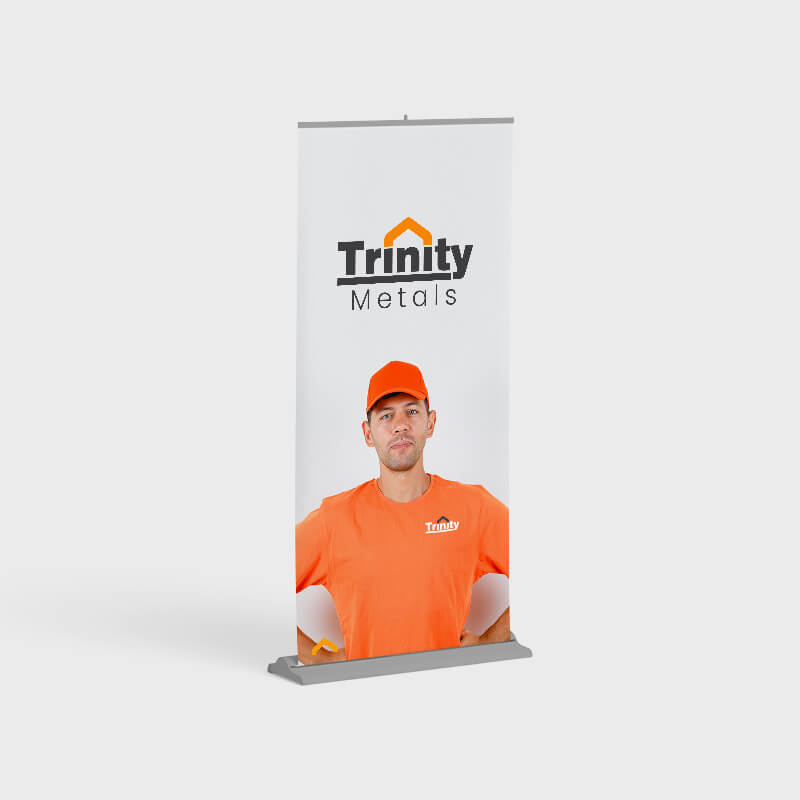
The logo has design flexibility, which means the logo can be adapted to any context or background. The rule of dominance harmony should apply every application.
Stand alone Design as well as vector design. can be adopted to any colour combinations. Can be used for general positioning of names such posters, banners, bills etc. with negative colour background
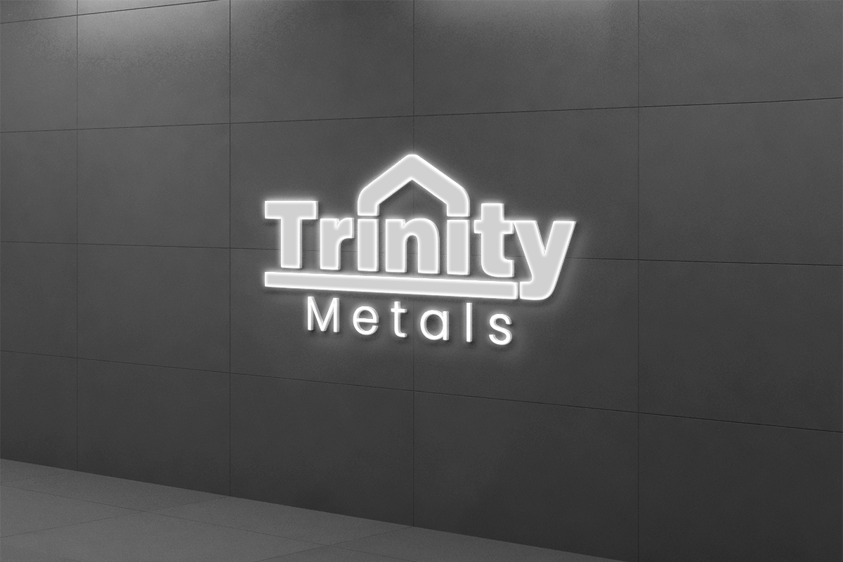
Inverted colour combinations. Can be applied on any colour context. Here the logo colour is white, can be replaced with any colour based on the colour tune balance or dominance harmony


Aniyara Adverts understands that branding encompasses more than just a logo or a name; it encapsulates the emotions and commitment that people have towards each business. We consistently strive to evoke these emotional connections for businesses that matter. Its a begining, All the best.

© 2026 All Rights Reserved.
