In an Indian dialect, the term “Aniyara” refers to “the people behind the scenes.” And we are Aniyara, the people behind the success. We are a team of experienced innovators specialised in business startups. Our goal is to assist you in introducing your brand to the proper demographic in the appropriate manner.Market research and business strategies drive every design we create.
We started our journey in 2018 as Brandfact Media in Kochi, India, in a partnership between Architect Jefry Babu and Mr. Paul Joseph. The firm was renamed in 2022 after it merged with the Aniyara Group of Companies. In addition to its offices in England and India, the firm has operations throughout the world. We have very active client community in Australia, Canada, India, Singapore, the US, UAE, and the UK.
Our team of Young Thinkers
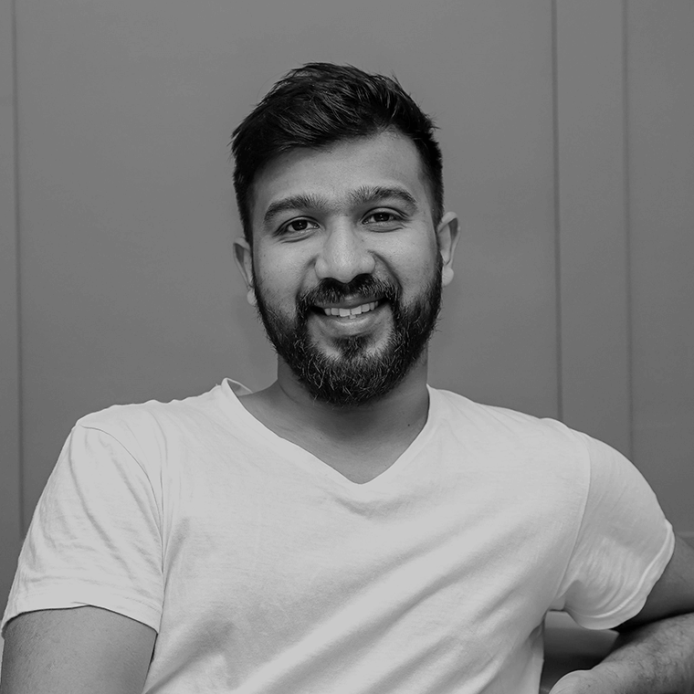
Founder, Creative Director, London, UK

Co-Founder, Brand Strategist, India
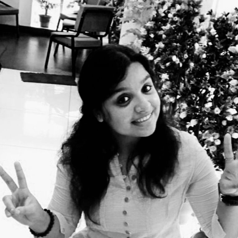
UI & UX, Web Designer, India

Senior Developer, London

Digital Marketing Manager, India
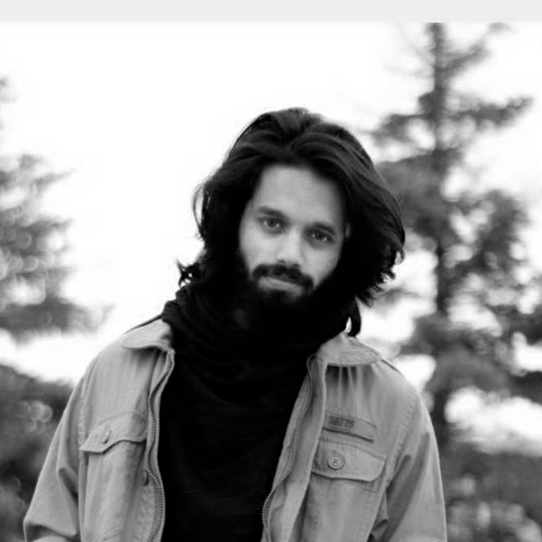
Media Production & Project Manager, Canada
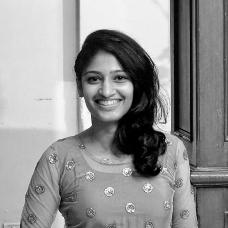
Illustrator, London

Business & Design Analyst

Content Creator, London

Social Media Manager, Belfast

Project Coordinator, Australia

Content Creator, Canada
Project Coordinator, Belfast
Our Trainees, Promises of Tomorrow

Youngest Creator London
Trainee Content Creator, London

Trainee Content Creator, India
There is a story behind every company, that could lead into business. Our logo’s and designs
Brands We Partner With









Elysium is an event management company based in Canada. The logo is designed in the combination of two key elements ”eye” and the letter “e”. The circular loop in the logo generates a field of depth, an infinity to space; the blank space inside the logo defines paradise (Elysium). The loop also indicates the confidence of the company, as everything is safe in our hands. The thickness of the lines bolded and narrowed to create a convex effect of the eyeball, states the motto of the company “All through our eyes”.
As is known, the Sri Amman (SAN) Academy of Architecture is famous for its arc-shaped building designed by Architect Giri. The iconic arc shape of the building was incorporated into the logo. In this case, the name of the institute, SAN itself acts as a logo, which is beneficial to marketing and publicity.
The company’s logo embodies their moral values by featuring the letters “OO” from the word “good” and the letter “m” from “Samaritan” arranged in a way that forms an abstract image of two people, with one person holding the other. This represents the care and support provided by the agency as a Good Samaritan. Additionally, the letter “t” from “Samaritan” is illustrated to resemble a plus symbol, which represents healthcare services and a cross, symbolizing the origin of the Good Samaritan story from the Bible.
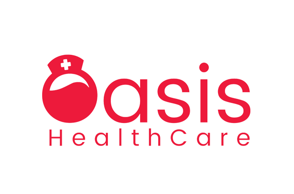
The logo was inspired by the notion of a desert oasis and the green trees that surround it. In the parched deserts, this greenery provides the greatest respite. A pool of water in a desert (like a wave) and a palm tree with branches (like a plus sign) close to the pool are illustrated in the letter “O” to represent this. A relative approach is used in the letter “O” in the logo as the face of a nurse with a cap on her head. The concept’s pictured pool of water serves as the head of a healthcare worker, the desert serves as its face, and the tree with branches and its box serves as a nurse’s cap.
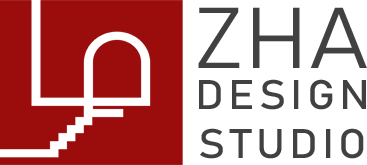
The logo is designed based on the modest form of the letter letter “ழ” which is written in English as “zha”. The letter had evolutions all over the period. Since we had a keen interest to unite the value architecture firm’s design rationales. The tale of the letter zha has a lot of tales to tell, The tale is replicated to a stair and the arch shape is replicated to a door. Every step leads to a door, this a basic of architecture. The open space with line climbs to the top is comparisons to a courtyard and its ledge wall. The originless line from the x-axis shows the design adaptation from the past and the line that extends through the y-axis represents the vision to the future.
The name “Trinity” evokes the concepts of ‘three’ and ‘unity.’ In the context of home supplies, hardware, and metals, it takes on even deeper significance. The repeated letter “i” in the name represents the pillars of the business empire, while the three-pointed roof connecting these pillars symbolizes the trio of individuals behind the business. The letter “n” is employed to signify infinity, reflecting the extensive range of products the company offers. By placing the ‘n’ beneath the roof, the logo conveys the brand’s commitment to offering a limitless array of products. The ‘n’ also doubles as a door, forming the shape of a house using the letter ‘i’ and adding a creative design element.
