Powered by Aniyara Ads.
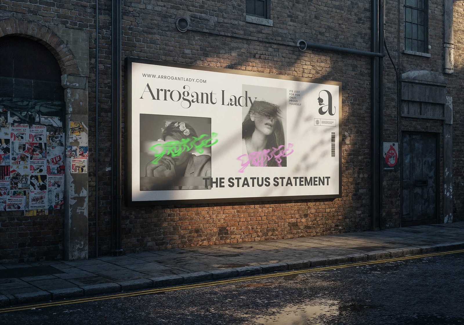
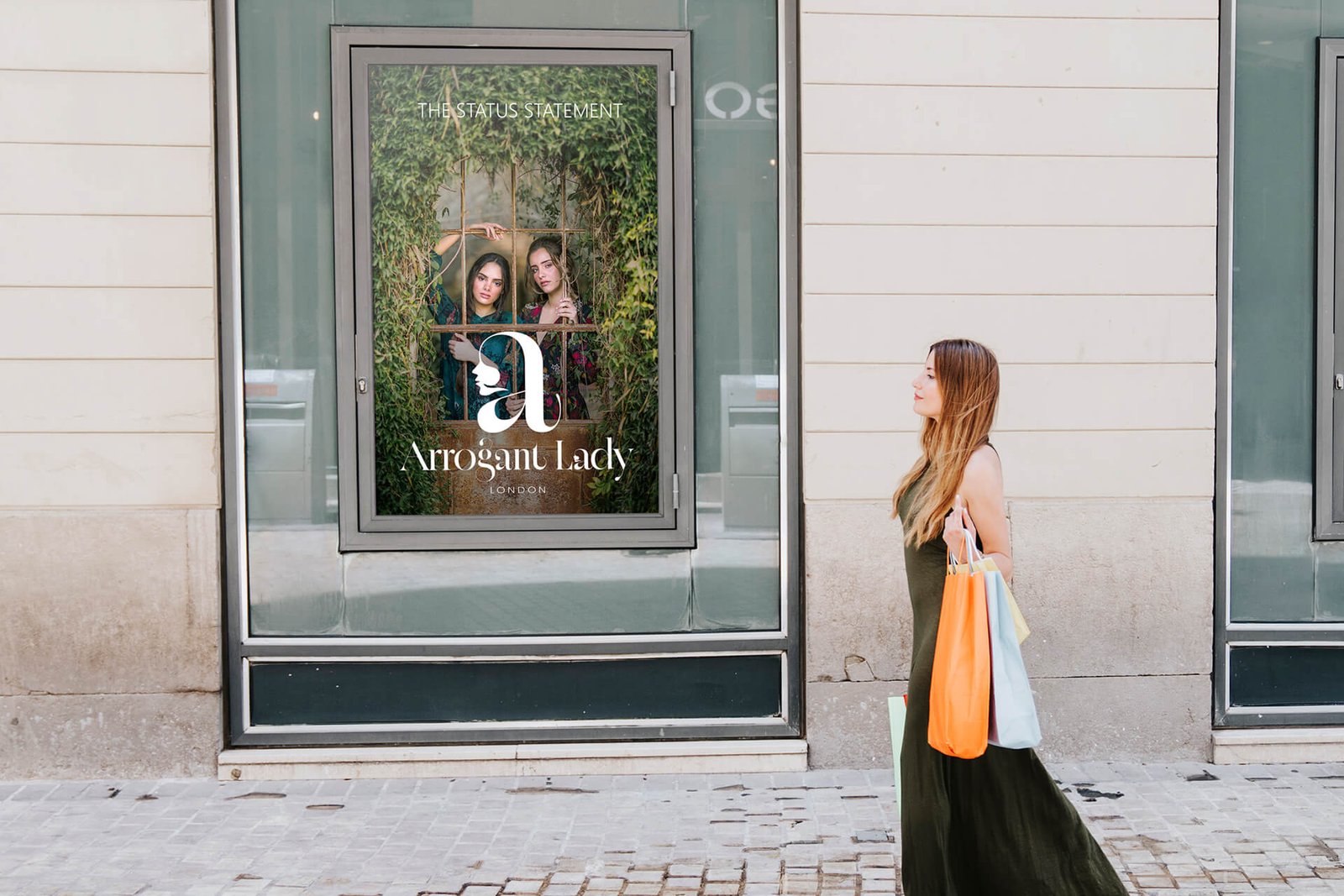
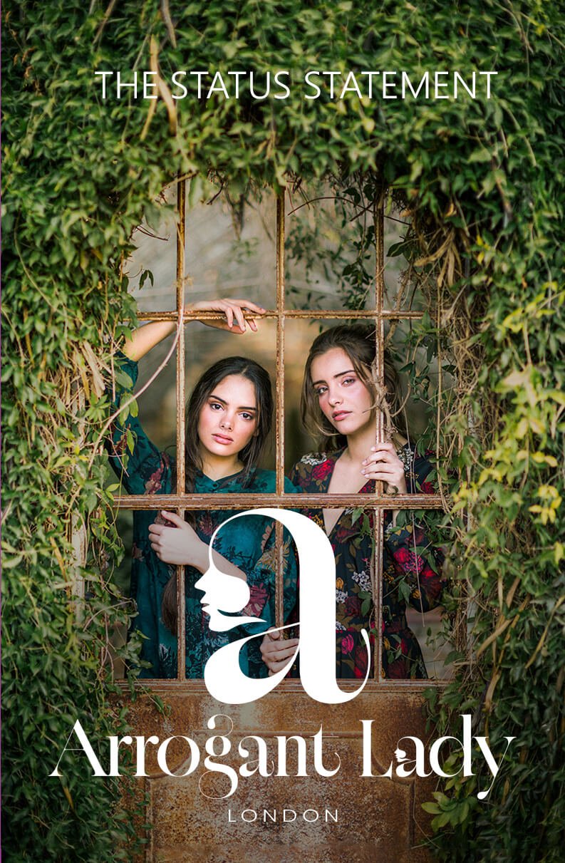
Arrogant Lady is not a label. It is a declaration.
Born in London, shaped by confidence, and worn by women who understand that presence speaks before words. This is fashion as authority. Clothing not designed to blend in, but to stand apart and be remembered.
At the heart of Arrogant Lady is status, not as excess, but as control. Control of silhouette. Control of detail. Control of how a woman enters a room and quietly owns it. Every piece is intentional. Every cut commands space. Every fabric choice is deliberate, chosen not for noise, but for power.
This is not trend-led fashion. It is precision dressing. Where structure matters. Where restraint is strength. Where elegance is sharpened by attitude. Each garment is crafted to elevate posture, sharpen energy, and reinforce identity. The clothes do not follow the woman. They frame her.
Arrogance, here, is not a flaw. It is self-assurance refined into style. It is knowing your value without explanation. Arrogant Lady designs for women who do not seek approval, only impact. Women who understand that true luxury is being unmistakable.
You do not wear Arrogant Lady to be seen.
You wear it to be acknowledged.
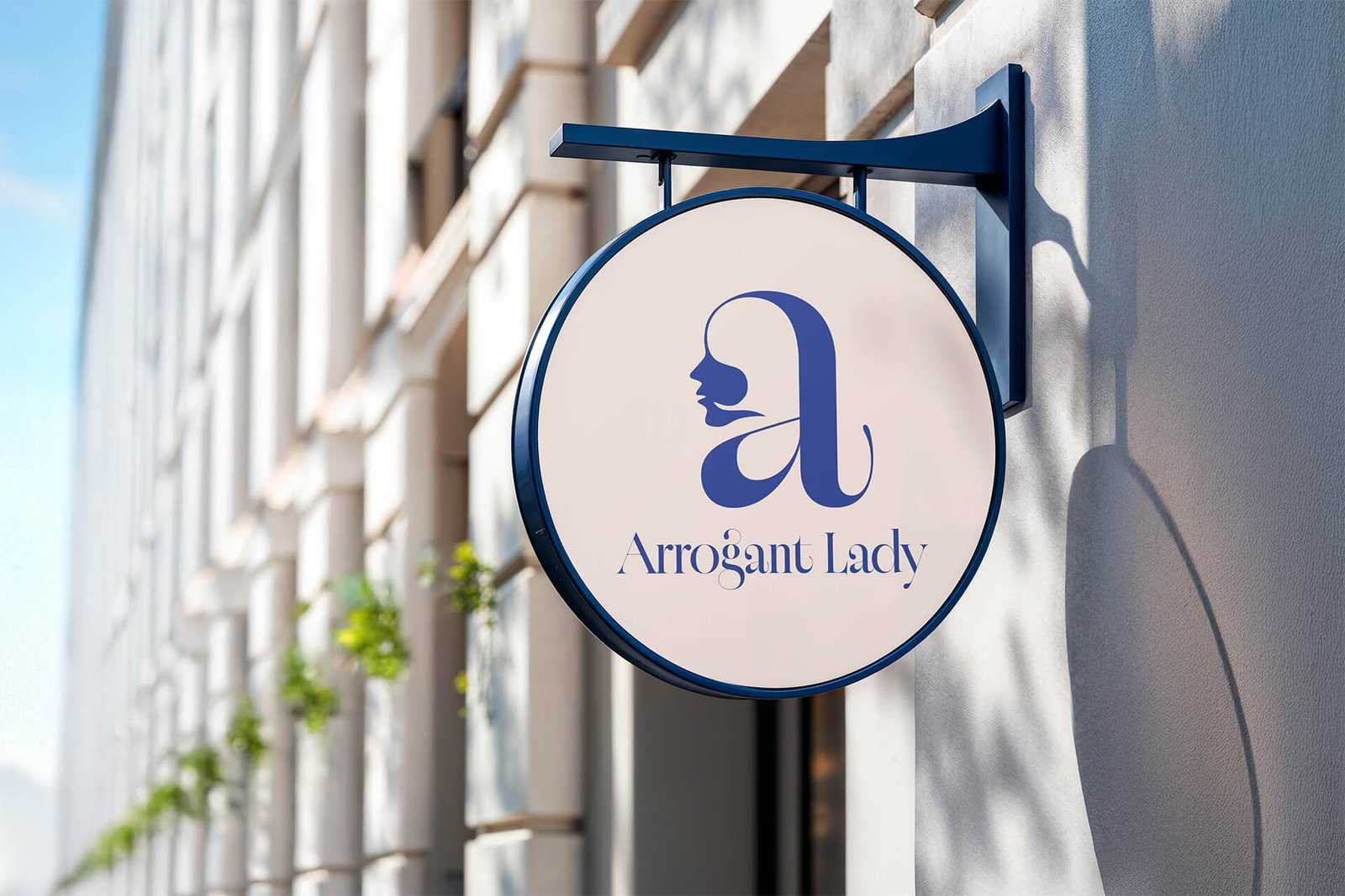
Arrogant Lady is distilled into a symbol of authority. The logo is not decorative. It is declarative.
At its core, the mark draws inspiration from the face of a queen, a quiet reference to sovereignty, poise, and inherited power. Not a literal portrait, but an essence. Strength softened by elegance. Command balanced with restraint. The face is abstracted to suggest presence rather than personality, allowing every woman who wears the brand to step into that role herself.
Interwoven within this form is the letter “a” from Arrogant, sculpted to feel architectural and intentional. The letter is not merely read, it is felt. It anchors the logo, reinforcing confidence, elevation, and self-assurance. The fusion of the queen’s visage and the letterform creates a singular icon where identity and authority coexist.
The logo functions as both symbol and signature. Designed to stand alone or be integrated seamlessly into garments, it can be embossed, woven, printed, or repeated as a pattern. It belongs as much to the fabric as it does to the brand, becoming part of the clothing rather than an afterthought.
This mark does not seek attention through excess. It commands recognition through presence.
Like Arrogant Lady itself, the logo is a status statement. Quietly powerful. Unapologetically feminine. Impossible to ignore.
a new meaning here: Obsessive Clothing Dialogue. A clothing brand that redefines the conversation in the fashion world. Or perhaps not just redefines, but changes the dialogue of dressing itself. We present a logo that meaningfully represents our brand identity – inspired by the iconic OCD symbol, yet infused with the essence of what we create: the “O” from OCD, the threads, and the garments that our brand is focused on. Dialogue itself is a language, sometimes even a scribble – and our logo embraces that thought. It is not just a mark; it’s a unique icon, one that can be woven into fabric patterns and adopted as part of the clothing itself. The OCD lettering also serves as a complementary logo, enabling easy and quick brand recognition. Its extended form, Obsessive Clothing Dialogue, stands both as our name and as a tagline that encapsulates our brand’s motive and voice.
All the Logos are designed in such a way that they are colour responsive. Colour adaptability is the trending and most accepted design criteria nowadays. This logo is also designed based on this principle only. The logos can adapt any colour depends on its background. Even though, we have choose Black as the base format colour. The choice of the logo’s colour, Black (#000000), stems from a careful study of similar brands worldwide. Brands like Zara, Gucci, Hermes, Only, Newlook, Chanel etc are successfully used black as their primary colour for decades. Black, in this context, functions as a classic and value generating colour. Base colour can be white, any neutral or even pastel colours. Also the brand can choose any colours purely based on the fabric design, for reference brands like Ralph Lauren and United Colours of Benetton.
01
Use 5% 0r 80% for composition
02
Use use 5%, 10% or 80% for composition
03
Use 5% 0r 10% for composition
04
Use 5% , 10% 0r 80% for composition
The logo has design flexibility, which means the logo can be adapted to any context or background. The rule of dominance harmony should apply every application.
Stand alone Design as well as vector design. can be adopted to any colour combinations. Can be used for general positioning of names such posters, banners, bills etc. with negative colour background
Inverted colour combinations. Can be applied on any colour context. Here the logo colour is white, can be replaced with any colour based on the colour tune balance or dominance harmony
Aniyara Ads understands that branding encompasses more than just a logo or a name; it encapsulates the emotions and commitment that people have towards each business. We consistently strive to evoke these emotional connections for businesses that matter. Its a beginning, All the best.
© 2026 All Rights Reserved.