An Identity that, fabricated Fabulous.
FAAB is a dynamic fabrication company headquartered in Ontario, specializing in creating exceptional retail and commercial interiors. With a focus on precision craftsmanship and innovative design, FAAB transforms spaces through bespoke fabrication and high-quality fittings tailored to each client’s unique vision.
The company’s extensive collection of premium fabrics ranges from luxurious textures to durable, functional materials, each selected to enhance the aesthetic and sensory experience of any space. Paired with a team of highly skilled fabricators, FAAB leverages cutting-edge techniques and meticulous attention to detail, ensuring every project not only meets but exceeds expectations.
FAAB is a fabrication company based in Ontario, specializing in retail and commercial interior fabrication and fittings. The company boasts a fabulous collection of fabrics and collective fabricators capable of transforming the visual aspects of any space.
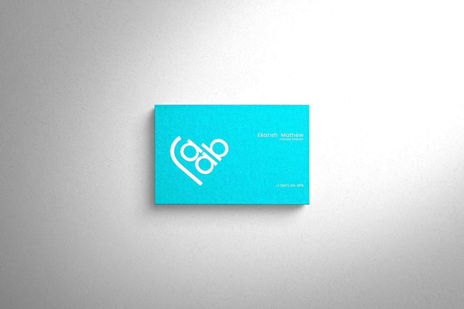
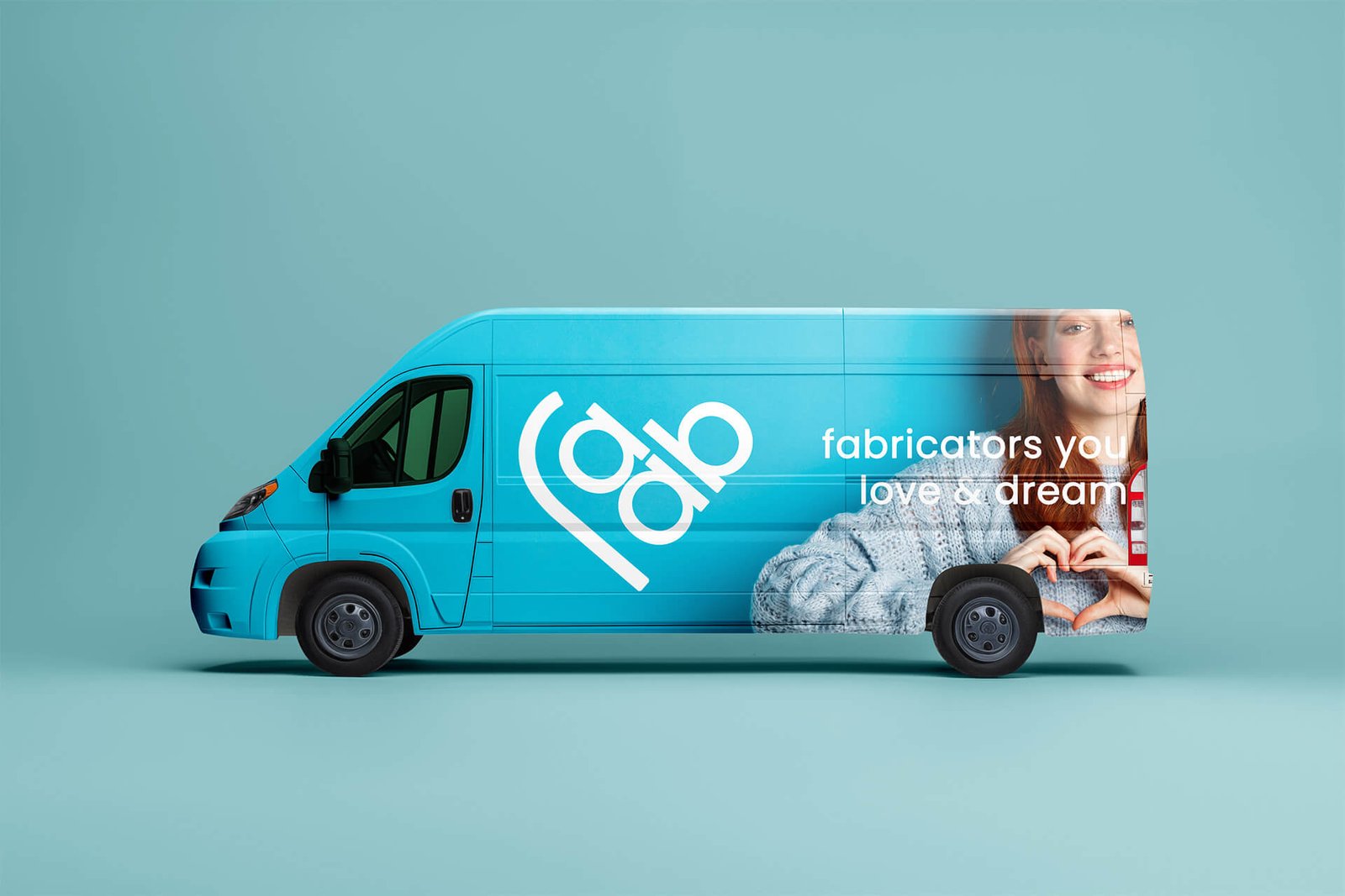
The FAAB logo is designed to integrate the name and symbol into a single, cohesive element. It represents the fabricators of your love and dreams, with a design that subtly resembles the symbol of love. This intentional approach helps people easily register the logo while simultaneously remembering the brand name.
The repeating letter A is strategically stacked, allowing the logo to be read as FAB or FAAB. The design is clear, bold, and memorable — resonating with the brand’s essence of fabricating love and dreams. This strategic design approach ensures the logo remains loud, recognizable, and firmly registered in people’s minds.
All the Logos are designed in such a way that they are colour responsive. Colour adaptability is the trending and most accepted design criteria nowadays. This logo is also designed based on this principle only. The logos can adapt any colour depends on its background. Even though, we have choose white / dark charcoal as the base format colour. The white / dark charcoal conveys neutral, balanced, stable and more over industrial. The choice of the logo’s colour, “Electric blue” (##00F0FF), stems from a careful study of similar firms worldwide. Electric Blue stands for vibrancy and creativity, giving it a contemporary edge. The promotional colour for the base text can be white, grey, or even black.
01
Use 5% 0r 80% for composition
02
Use use 5%, 10% or 80% for composition
03
Use 5% 0r 10% for composition
04
Use 5% , 10% 0r 80% for composition
The logo has design flexibility, which means the logo can be adapted to any context or background. The rule of dominance harmony should apply every application.
Stand alone Design as well as vector design. can be adopted to any colour combinations. Can be used for general positioning of names such posters, banners, bills etc. with negative colour background
Inverted colour combinations. Can be applied on any colour context. Here the logo colour is white, can be replaced with any colour based on the colour tune balance or dominance harmony
Aniyara Ads understands that branding encompasses more than just a logo or a name; it encapsulates the emotions and commitment that people have towards each business. We consistently strive to evoke these emotional connections for businesses that matter. Its a begining, All the best.
© 2026 All Rights Reserved.