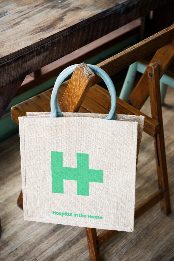
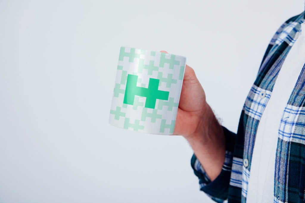
Hospital in the Home (HITH) is a healthcare service that extends hospital-level care to patients within their own homes. The fundamental idea behind HITH is to provide patients with the necessary medical attention, treatments, and monitoring typically available in a hospital setting, but in the familiar and comfortable environment of their own home.
The choice of the name “Hospital in the Home” underscores the central concept: bringing the hospital to the patient’s residence. This not only emphasizes the continuity of care but also highlights the seamless transition between hospital and home settings.
The letter ‘H’ serves as a common element in both “Hospital” and “Home,” symbolizing the connection between the two environments. Additionally, the incorporation of the plus symbol (+) carries multiple symbolic meanings. It represents the hospital sign, which is often symbolized by a cross, while also signifying the concept of addition, implying that the home environment becomes an extension of the hospital’s care continuum. By combining the plus sign with the letter ‘H’ to create a unique logo, Hospital in the Home services establish a visual identity that communicates the integration of hospital-level care with the comfort and convenience of home-based healthcare. This logo serves as a visual representation of the innovative approach to healthcare delivery, highlighting the flexibility and adaptability of modern medical services to meet patients’ evolving needs.

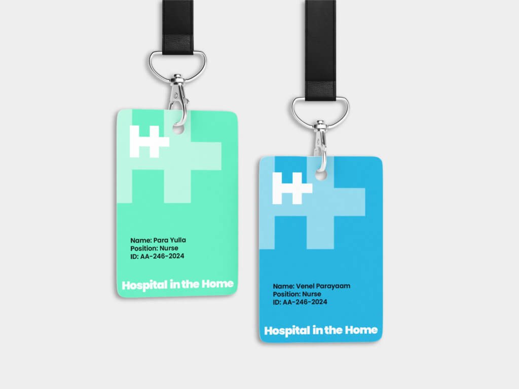
All the Logos are designed in such a way that they are color responsive. Colour adaptability is the trending and most accepted design criteria nowadays. This logo is also designed based on this principle only. The logos can adapt any color depends on its background. Even though, we have choosed light greenish blue as the base format colour. The light greenish-blue color is used for several reasons. It’s chosen for its calming effect, which can help reduce stress and anxiety in patients and staff. Additionally, this color is often associated with cleanliness and hygiene, promoting a sense of sterility and safety in medical environments. Moreover, it’s believed that this color can help improve concentration and focus, which is beneficial for both patients and healthcare professionals. Also, the promotional color for the base text can be bluish cyan, white, grey, or even black.
01
Use 5% 0r 80% for composition
02
Use use 5%, 10% or 80% for composition
03
Use 5% 0r 10% for composition
04
Use 5% , 10% 0r 80% for composition
The logo has design flexibility, which means the logo can be adapted to any context or background. The rule of dominance harmony should apply every application.
Stand alone Design as well as vector design. can be adopted to any colour combinations. Can be used for general positioning of names such posters, banners, bills etc. with negative colour background
Inverted colour combinations. Can be applied on any colour context. Here the logo colour is white, can be replaced with any colour based on the colour tune balance or dominance harmony


Aniyara Ads understands that branding encompasses more than just a logo or a name; it encapsulates the emotions and commitment that people have towards each business. We consistently strive to evoke these emotional connections for businesses that matter. Its a begining, All the best.
© 2026 All Rights Reserved.
