meanwhile
in cochin

"art, architecture, narratives"

Meanwhile in Cochin is an architectural practice rooted in storytelling, place, and artistic exploration. The studio approaches design as a reflective process shaped by climate, culture, memory, and everyday rituals, always seeking clarity of intent what a building should mean as much as what it should do.

Alongside commissioned work, the firm actively engages in research and experimentation, using speculative projects, material investigations, and spatial prototypes to test new ideas and construction possibilities. By blending rigorous architectural thinking with artistic intuition, Meanwhile in Cochin develops work that is contemporary, contextual, and enduring rather than driven by short-lived trends.

Logo that Says Everything

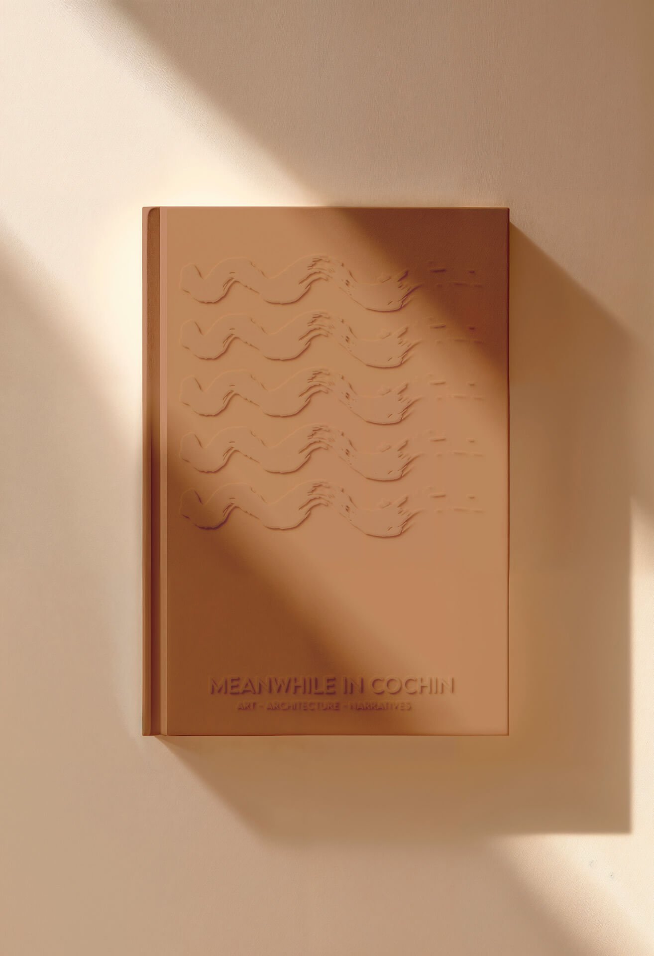
The logo is built around the initials “M” and “W” from the brand name Meanwhile in Cochin, an architectural firm with art and architectural narratives. These two letters are abstracted into a single, flowing brush stroke that simultaneously suggests the form of a wave and the combined shapes of “M” and “W.” This fluid gesture evokes movement, creativity, and the coastal spirit of Cochin.

To further express the firm’s artistic sensibility and storytelling approach, a delicate paper boat is placed within the wave. The boat becomes a symbol of imagination, craftsmanship, and exploration suggesting ideas in motion and architecture as a poetic journey rather than a purely technical exercise. Together, the wave, brush stroke, and paper boat create a mark that balances simplicity with layered meaning, capturing the studio’s fusion of art, place, and architectural expression.

artA brand reshaping the language of art with architecture that builds design, identity, and style.

Theme

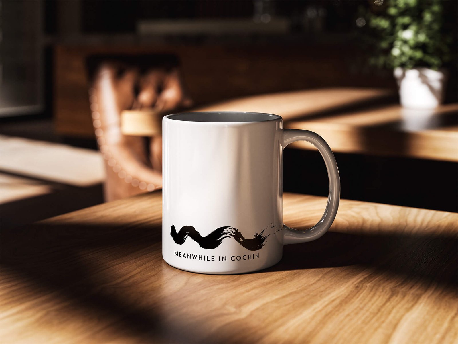
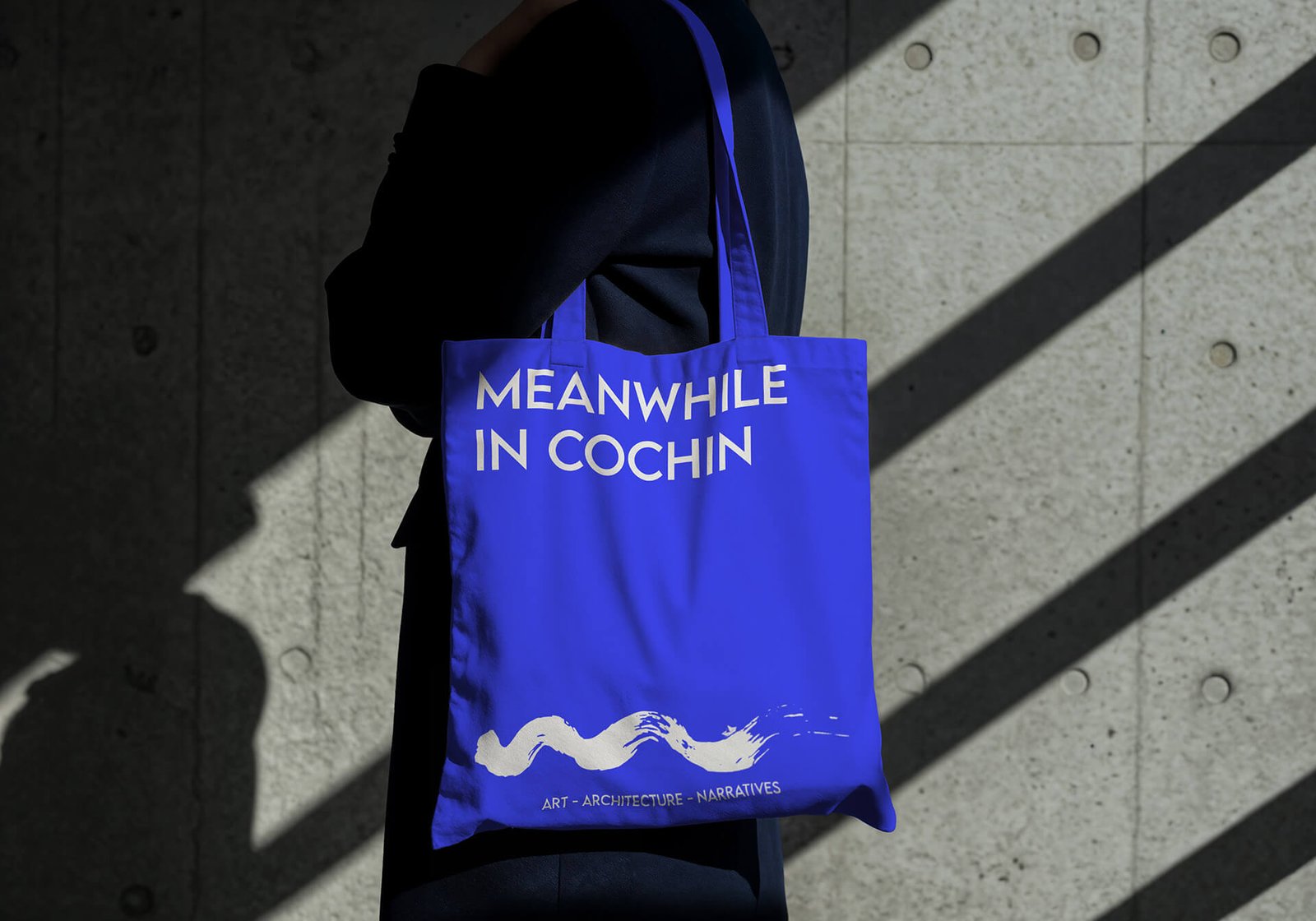
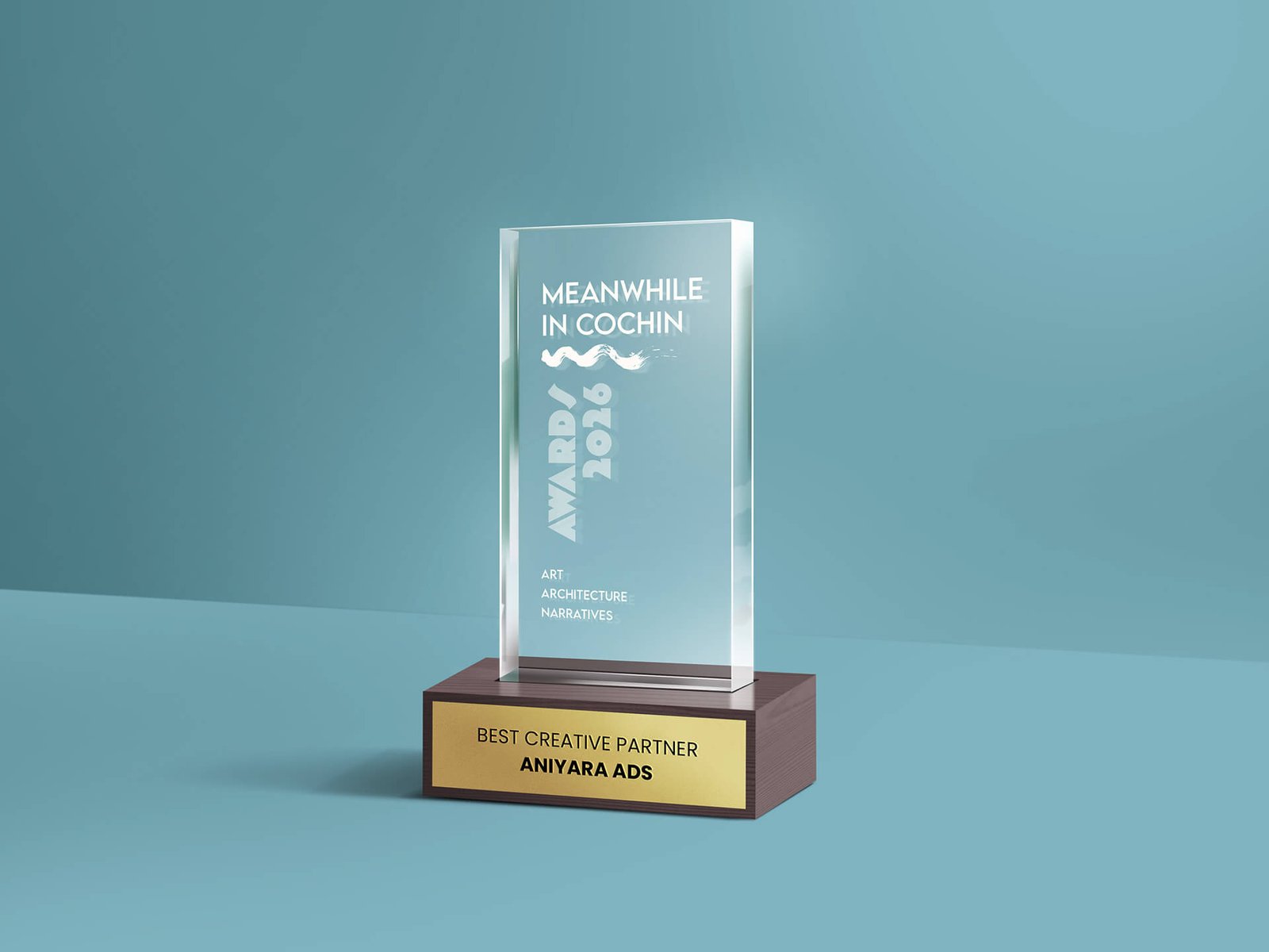
All the Logos are designed in such a way that they are colour responsive. Colour adaptability is the trending and most accepted design criteria nowadays. This logo is also designed based on this principle only. The logos can adapt any colour depends on its background. Even though, we have choose Black as the base format colour. The choice of the logo’s colour, Black (#000000), stems from a careful study of similar ai brands worldwide. Brands like Open AI, Perplexity, Anthropic, Grok, Mid Journey, etc are successfully using black as their primary colour. Black, in this context, functions as a classic and value generating colour. Base colour can be white, any neutral or even pastel colours. Also the brand can choose any colours purely based on the webpage design, for reference brands Google Gemini. All the colours used in the mockup images below are for  various use cases and used for expressions only.

01

#Any Colour

Use 5% 0r 80% for composition

02

#fFFFFF, White

Use use 5%, 10% or 80% for composition

03

#5A59595, Grey

Use 5% 0r 10% for composition

04

#000000, Black

Use 5% , 10% 0r 80% for composition

How to use?

Adaptability

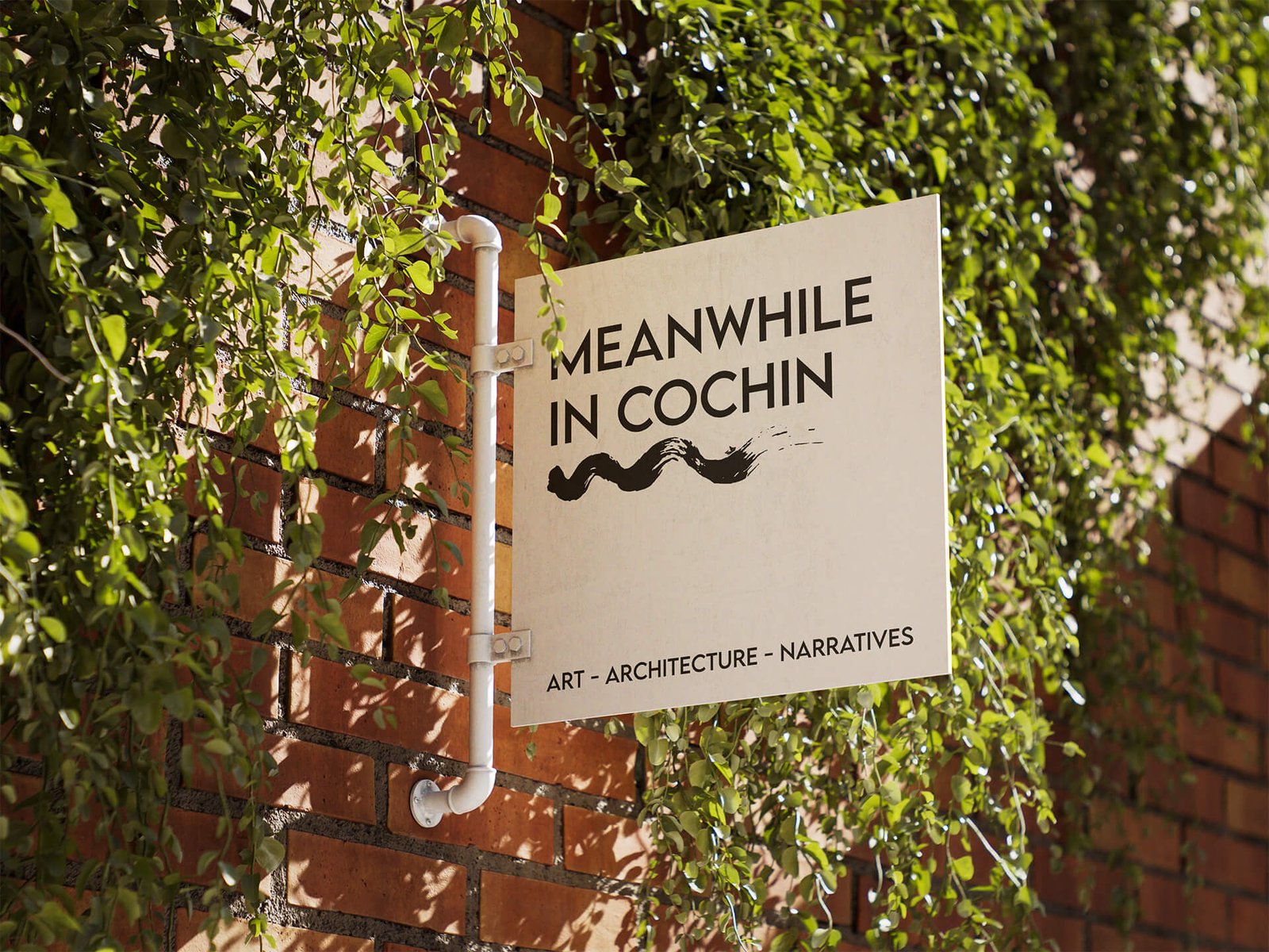
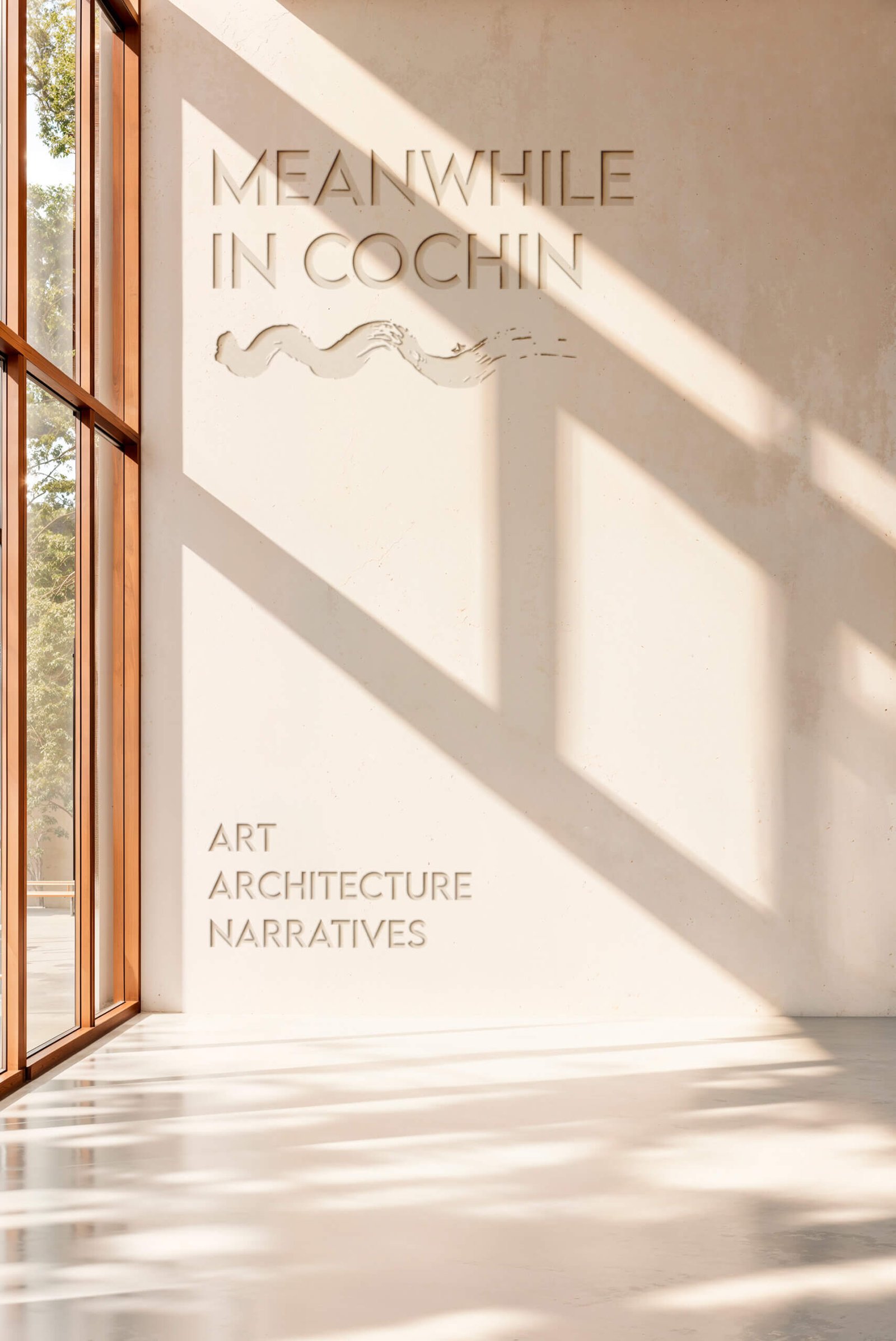
The logo has design flexibility, which means the logo can be adapted to any context or background. The rule of dominance harmony should apply every application.

Vector Design

Stand alone Design as well as vector design. can be adopted to any colour combinations. Can be used for general positioning of names such posters, banners, bills etc. with negative colour background

Fertility

Inverted colour combinations. Can be applied on any colour context. Here the logo colour is white, can be replaced with any colour based on the colour tune balance or dominance harmony