thriya.ai
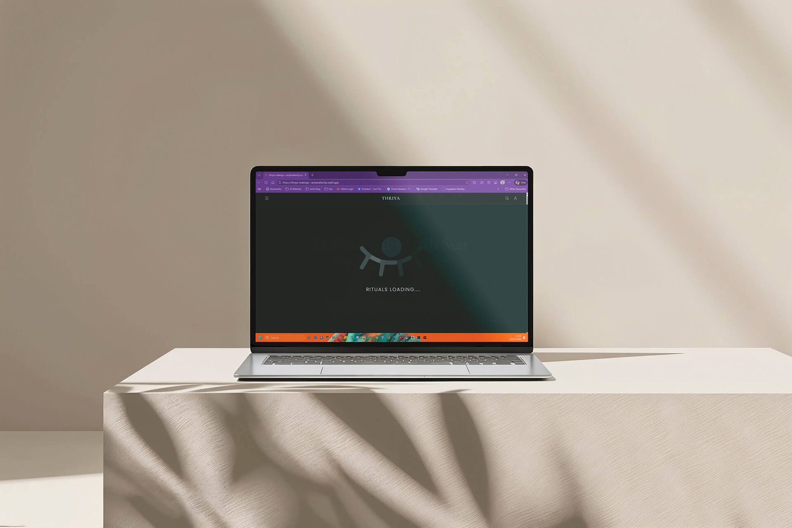
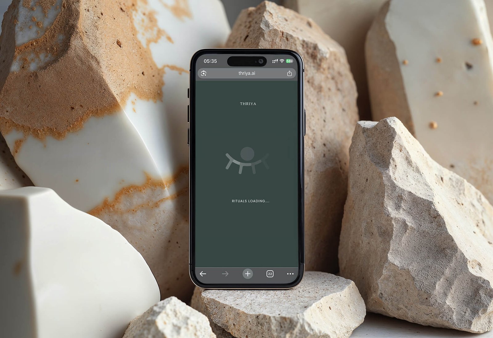
Thriya is a thinking and clarity platform designed to help individuals and teams develop long-term direction rather than rely on disposable answers. It provides private, encrypted “pods” where users can store reflections, recurring workflows (“rituals”), and personal history to build deeper insight over time. Thriya’s system emphasizes persistent memory, structured reflection, and synthesis of thoughts to surface an individual or group’s “North Star” – a guiding purpose or direction. The product frames itself as a third eye for deep thinking and sustained clarity, rather than a typical generative chat tool, with features like long-term memory, recurring sessions, and consensus mapping for team alignment.
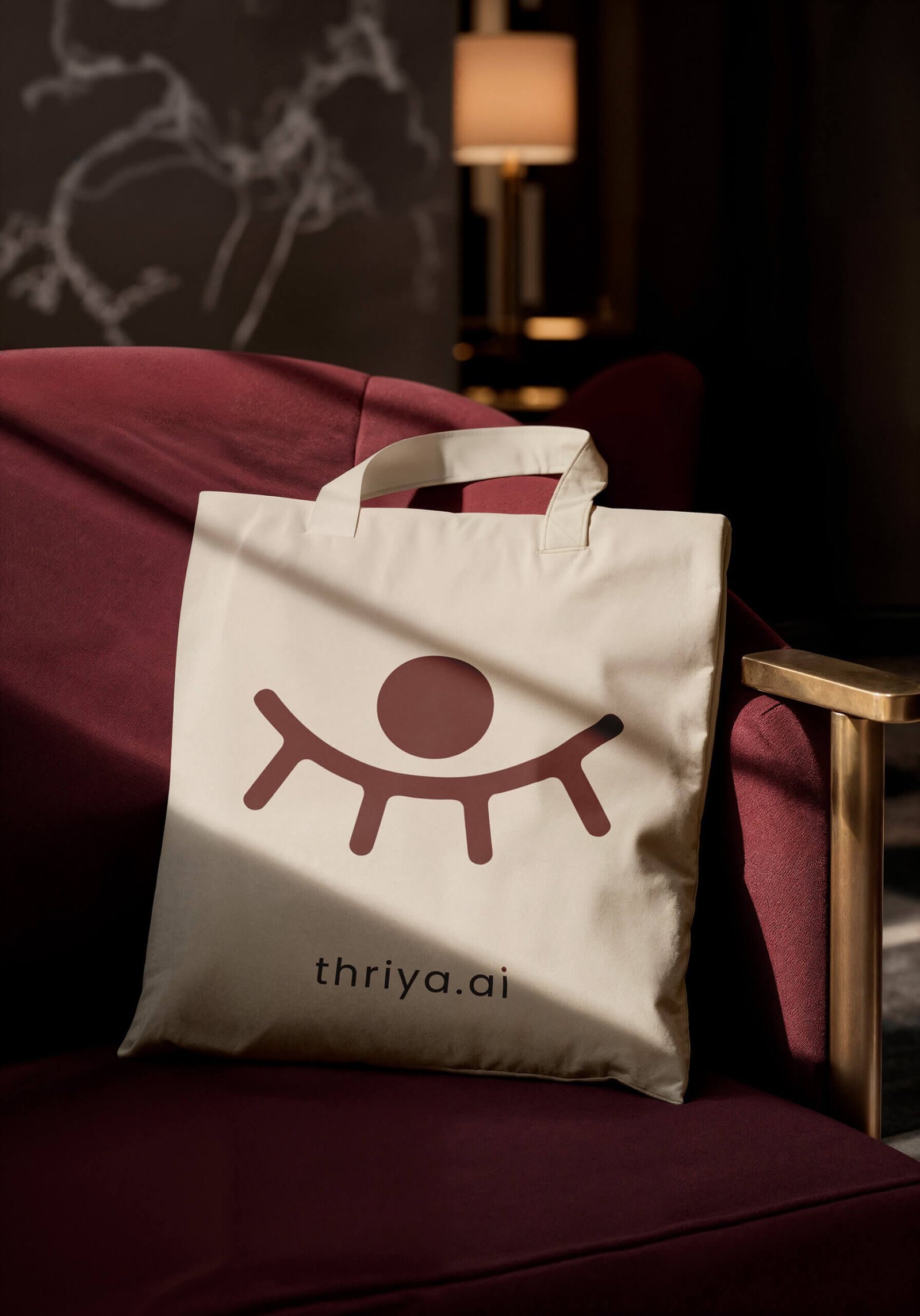
The Thriya.ai logo is designed around three core ideas drawn from the platform’s philosophy.
First, Thriya functions like a third eye, an inner eye that remains open even when our physical eyes are closed. The third eye represents deeper awareness, self-clarity, and connection to one’s inner self. Reflecting this principle, the logo depicts closed eyelids with an eye opening within, symbolizing the emergence of clarity from introspection and preserved thought.
Second, Thriya is a space where individuals can express their thoughts, actions, and reflections in full. The central circle represents the mind or head, while the surrounding curves and threads symbolize the body of one’s experiences and mental load one carries. By sharing and reflecting on these elements, users resolve complexity and move toward discovering their personal North Star.
Third, the outward projections from the curves represent individuals. In Thriya, teams converge toward a shared center (the circle) where collective context is preserved, patterns emerge, and intentions align. This convergence enables groups to reflect together and gain clearer direction over time.
All the Logos are designed in such a way that they are colour responsive. Colour adaptability is the trending and most accepted design criteria nowadays. This logo is also designed based on this principle only. The logos can adapt any colour depends on its background. Even though, we have choose Black as the base format colour. The choice of the logo’s colour, Black (#000000), stems from a careful study of similar ai brands worldwide. Brands like Open AI, Perplexity, Anthropic, Grok, Mid Journey, etc are successfully using black as their primary colour. Black, in this context, functions as a classic and value generating colour. Base colour can be white, any neutral or even pastel colours. Also the brand can choose any colours purely based on the webpage design, for reference brands Google Gemini. All the colours used in the mockup images below are for various use cases and used for expressions only.
01
Use 5% 0r 80% for composition
02
Use use 5%, 10% or 80% for composition
03
Use 5% 0r 10% for composition
04
Use 5% , 10% 0r 80% for composition
The logo has design flexibility, which means the logo can be adapted to any context or background. The rule of dominance harmony should apply every application.
Stand alone Design as well as vector design. can be adopted to any colour combinations. Can be used for general positioning of names such posters, banners, bills etc. with negative colour background
Inverted colour combinations. Can be applied on any colour context. Here the logo colour is white, can be replaced with any colour based on the colour tune balance or dominance harmony