It’s an identity made
visible through Design.
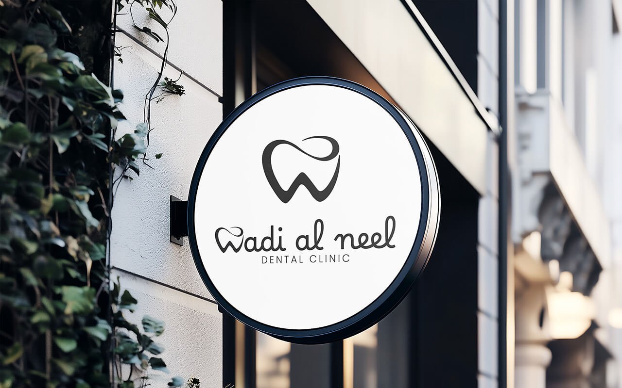
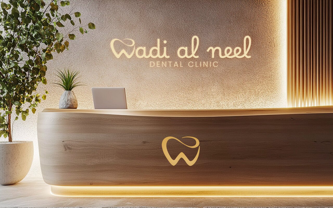
Wadi Al Neel is a dental practice established by dedicated dentists united by a single vision—to make exceptional dental care both accessible and inviting for everyone. Set in the vibrant heart of Dubai, the clinic is purposefully designed to feel approachable, clean, and contemporary, embodying a sense of trust and openness.
Every detail, from the brand language to the spatial design, was crafted to express care without intimidation. With a focus on simplicity and warmth, the space and identity together create an atmosphere that welcomes patients, eases anxieties, and reinforces the belief that a healthy smile is a right, not a luxury.
The logo is a refined visual statement built around the universal symbol of a tooth—integrated with the letter W in a sleek, modern composition. This thoughtful fusion creates a mark that is instantly recognizable, friendly, and trustworthy. It balances professionalism with warmth, embodying both the essence of dentistry and the brand name Wadi Al Neel.
All the Logos are designed in such a way that they are colour responsive. Colour adaptability is the trending and most accepted design criteria nowadays. This logo is also designed based on this principle only. The logos can adapt any colour depends on its background. Even though, we have choose gold/ white as the base format colour. The white / gold conveys elegant, quality, and more over valuable. The promotional colour for the base text can be white, grey, or even black.
01
Use 5% 0r 80% for composition
02
Use use 5%, 10% or 80% for composition
03
Use 5% 0r 10% for composition
04
Use 5% , 10% 0r 80% for composition
The logo has design flexibility, which means the logo can be adapted to any context or background. The rule of dominance harmony should apply every application.
Stand alone Design as well as vector design. can be adopted to any colour combinations. Can be used for general positioning of names such posters, banners, bills etc. with negative colour background
Inverted colour combinations. Can be applied on any colour context. Here the logo colour is white, can be replaced with any colour based on the colour tune balance or dominance harmony
Aniyara Ads understands that branding encompasses more than just a logo or a name; it encapsulates the emotions and commitment that people have towards each business. We consistently strive to evoke these emotional connections for businesses that matter. Its a begining, All the best.
© 2026 All Rights Reserved.